by Guest Contributor Amanda Padgett
Hello fellow photography enthusiasts! Today I am going to show you how to think outside the box when it comes to getting rid of unwanted objects in a picture.
Yes, content aware and clone stamp are fantastic and wonderful and amazing – but sometimes they can be temperamental and it may take a while to get what you want. However, when you have an image that is symmetrical or nearly so, and one side is perfect while the other is wrought with problems, there is a super quick and super simple fix – duplicating the background and flipping the layer horizontally.
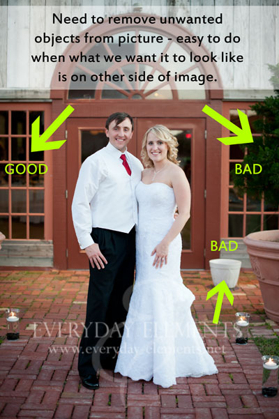
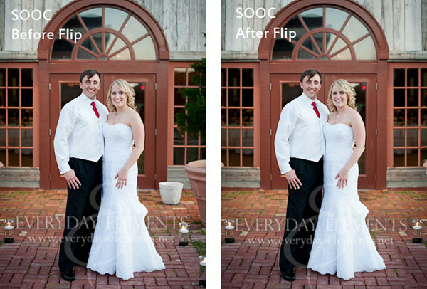
Look at the picture above; one side is lovely and perfect while the other side has an unsightly white flower pot and a large potted tree. Since this image was intended to be symmetrical, I am going to build on that and simply copy the good side onto the bad side.
First I duplicated the background (control/command + j). Then I flipped it horizontally.
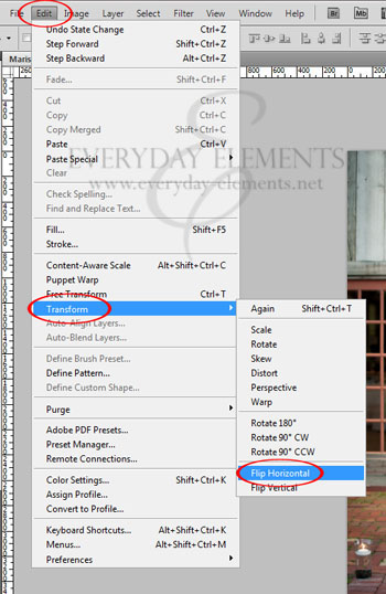
To flip a layer horizontally in Photoshop CS#, go to Edit, then Transform, then Flip Horizontal.
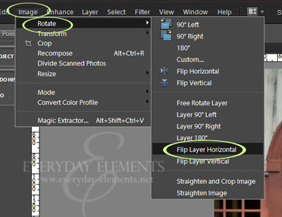
To flip horizontally in Photoshop Elements 10 (and older versions) go to Image, then Rotate, then Flip Layer Horizontal.
After I flipped the layer so that the “good” side is where I want it, I add a black mask to conceal the whole layer.
To add a black mask simply add a mask using the mask icon at the bottom of the layers palette, then press control/command + i, to invert the mask from white to black.
After inverting the mask to black, use a white brush at 100% brush opacity and brush over the bad area, so that the image (with the good side showing) will be revealed.
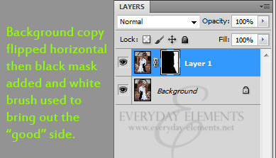
The steps are the same in PSE as in Photoshop.
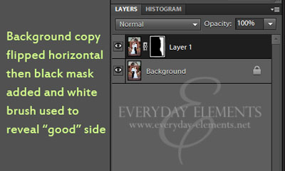
If your “good” image doesn’t line up just as it should, you can use the Move tool (v on keyboard) to move it where you need it to be.
Was that fast or what??
The video tutorial below shows these steps for BOTH Photoshop Elements and Photoshop CS5. The video starts with PSE then moves to CS5. Also, I show another image in the video so you can see another application of this technique.
![]()

Hello! I’m Amanda, a quirky, introverted Mom of four, who is passionate about helping others learn their cameras and editing software. I also currently homeschool my four kids, ages 13 to 6, all whom run away when they see me carrying my camera.
Visit me at my WEBSITE and FACEBOOK page!






Great tutorial. Thanks for sharing! I pinned it 🙂
Awesome! I needed this. Thanks!
Thank you!!!!! I was able to ‘save’ an image that really needed this application.
Very interesting “flip” tutorial I must admit I would have never thought about that! Thanks for posting!
Great tips Amanda! It’s so important to educate photographers that many shots are not drop dead gorgeous straight out the camera. One of the first things that really floored me when I first got into photography was the realization that all those incredible, amazing sunsets I was waiting to see someday (you know, the ones in calendars) was not exactly possible without a little help from Fuji Velvia. Now we do it in photoshop. But the point it is, sometimes you have to help make it perfect.
Thank you!! I had a hard time finding and using masks in PSE8 now i got it!
Awesome. Thanks!
Great tip today! Thanks!
What a great tip! The photo looks much better!
Fantastic. Simple language and step by step video. AWESOME.
Absolutely wonderful tutorial. Thank you!
I have been trying to do this forever, I thought there must be a mirror image clone technique or something. But now I finally know how to flip the dumb layer! Lol, THANK YOU!!
🙂
awesome tutorial. I’ll have to keep this in mind for future reference. Thanks for sharing it!
Thanks for sharing! I hadn’t thought of that for symmetrical images!
Amanda, your tutorials are so well done and I love what you do.
I love this idea. I have a question though. I am doing a photo directory for a church. The shot I have of the church has 2 handicap parking signs in it. I can’t figure out how to remove them and it not look like I’ve removed something because the grass is blurry or something. In the website part I put a direct link to what I’m talking about. Its not the exact image I’m using but it shows you what I’m talking about. The photo I’m using is zoomed out a bit more and I have added a transparent Jesus over it. The signs are just killing me.
Followed Rock the Shot on Facebook
Very nice trick! Now, I have a pretty lame monitor on the pc I am currently on but I swear the fixed shot also has some added warmth, like an “81A filter”… 🙂
Excellent tutorial!
Awesome info!!! Thanks for this!
I KNEW there had to be a way to do this! I had been opening the picture again, flipping that & copying it over. This is SO much easier…THANK YOU!!
This is awesome tip! Thanks