by guest contributor Anna Gay
If you are new to editing with textures, but aren’t sure where to start, here are a few tips to get you going.
First, you are going to need a program like Photoshop (Elements or Creative Suite) that will allow you to overlay images on top of one another.
The ways in which you can incorporate textures into your workflow are many and varied, so for this tutorial, we will just look at two basic hues – warm and cool, and a some of the different blending modes in Photoshop such as Overlay, Soft Light, Vivid Light and Multiply.
Hue
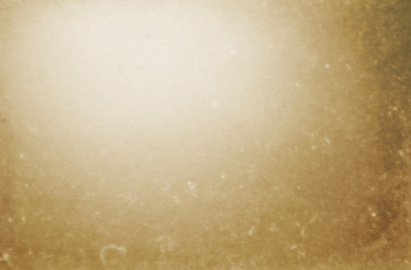
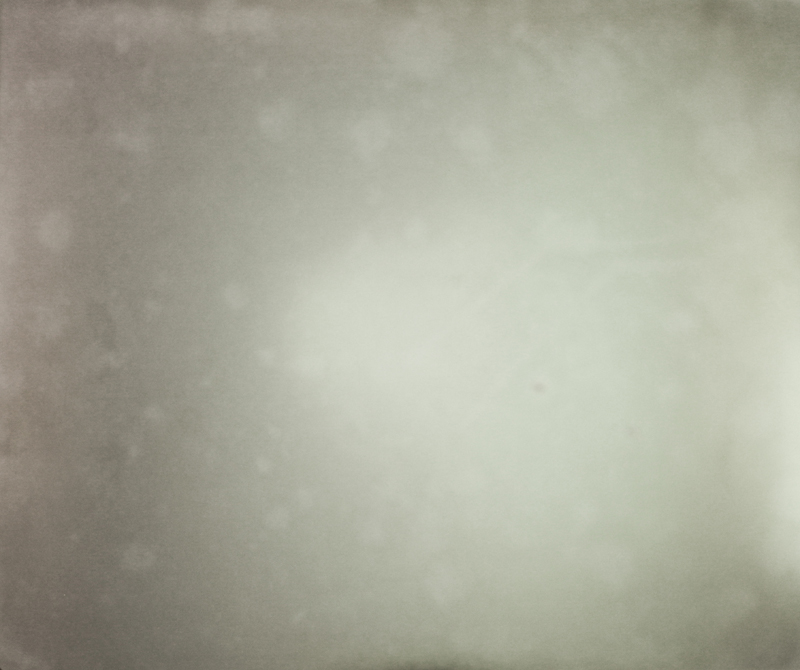
Using textures is a way to edit the hue of your image. If you would like to warm up the image, use a texture with a warm hue. The same thing goes if you would like a cooler hue – use a texture with a cool hue.
Warm Texture:
Cool Texture:
Tonal Range
You will often notice textures that have been created specifically for overlaying on top of images will have a bright center with darker edges. With this type of texture, you can brighten the tones at the center of your image, which will draw the focus to your subject and add a natural-looking vignette to the edges of your image.
Artifacts
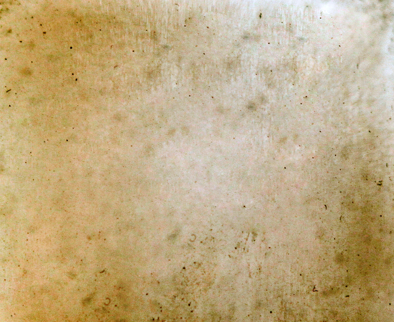
I like to refer to the spots and scratches in textures as “artifacts.” Some textures have more artifacts than others, but using textures will a lot of artifacts is a good way to give your images a distressed look.
Editing
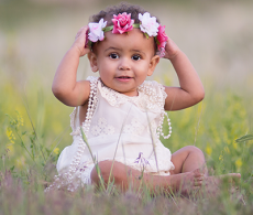
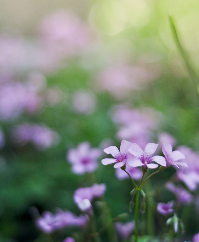
Let’s look at a few different ways you can edit using these texture examples. Here is the image before being edited:
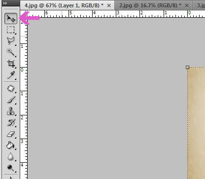
Using the Move tool in your right-hand toolbar, drag and drop the texture onto the image you would like to edit. Next, you can use your mouse to move/stretch the texture until it fits the size of your image:
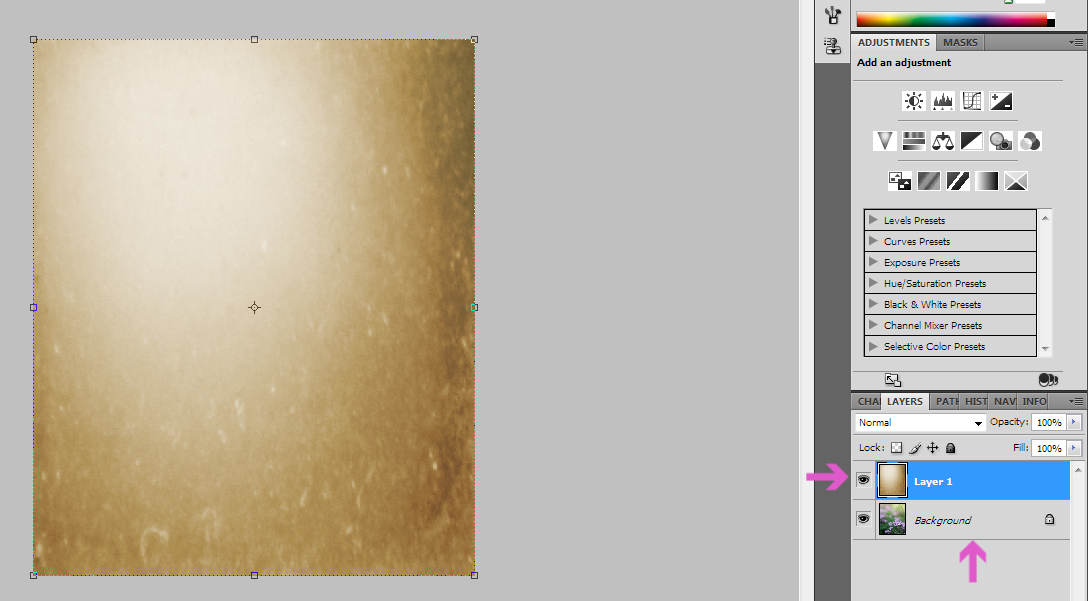
You should now have a Background layer (your original image) and a Layer 1 (your texture)
Blending Mode – Overlay
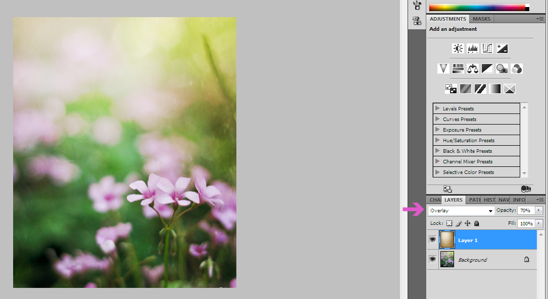
Next, let’s set the Blending Mode to Overlay. Usually, at full, 100% Opacity, textures will be a bit too strong, so you will need to reduce the Opacity until you are satisfied. For this image, my Opacity is set to 70%.
Overlay is a popular Blending Mode, as it will add contrast and depth to your image.
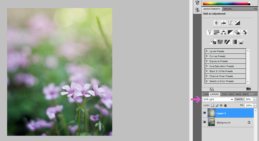
Blending Mode – Soft Light
Now, let’s take the same steps we did above with the warmer texture, but this time using a cooler texture.
Let’s try Soft Light as our Blending Mode, as it is similar to Overlay, except that it doesn’t have quite the same level of intensity in the contrast. For this image, I reduced the Opacity to 90%, resulting in a hazy, cool effect:
Blending Mode – Vivid Light & Multiply
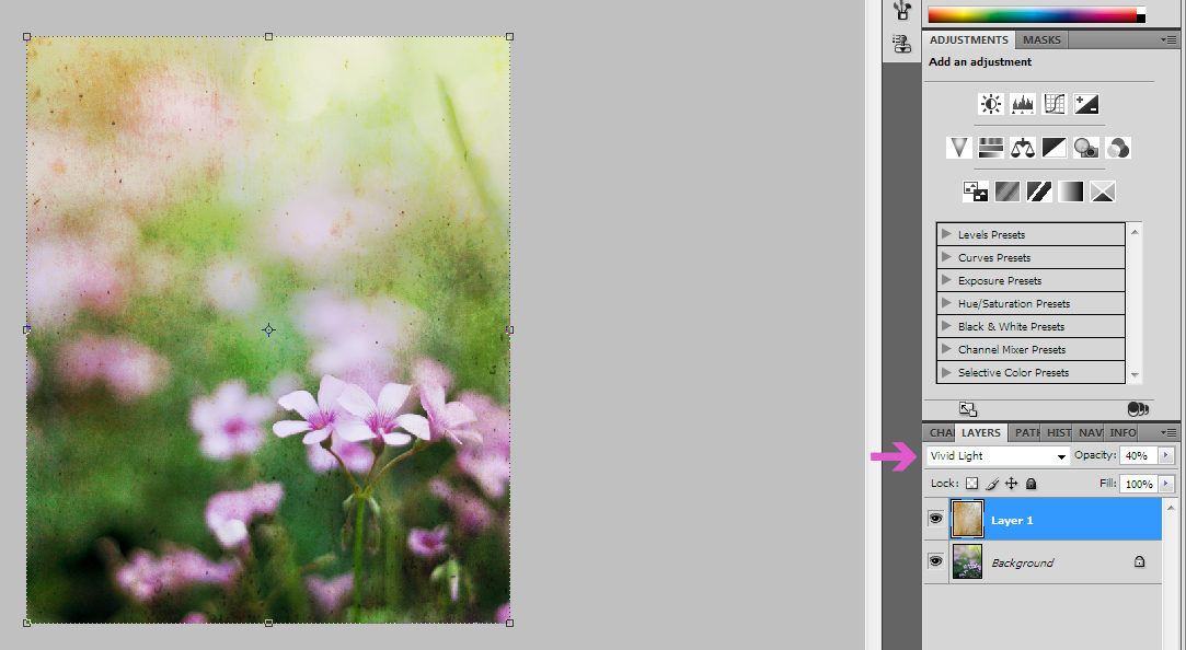
Let’s say you want to go all-out with your textures, so let’s try using a texture with a lot of specks/scratches to really distress the image.
This time, I set the Blending Mode to Vivid Light, but needed to reduce the Opacity all the way to 40%. Vivid Light both brightened the image, and added quite a bit of texture.
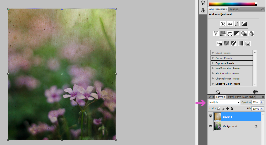
If you want to darken your image for a really moody and distressed look, experiment with Multiply as your Blending Mode, as this mode will darken your image.
This was a crash-course in the absolute basics of textures. Just for a visual reference, here are all of the different Blending Modes we used, so you can do a side-by-side comparison:

Like I said at the beginning, there are endless ways to use textures, and these are just a few examples, so be sure to play around until you find a way of editing with textures that suits your style – that’s half the fun!
All images and textures are © Anna Gay. Please do not download without permission.
![]()
 About the Author: Anna Gay is a portrait photographer based in Athens, GA and the author of the dPS ebook The Art of Self-Portraiture. She also designs actions and textures for Photoshop. When she is not shooting or writing, she enjoys spending time with her husband, and their two cats, Elphie and Fat Cat.


