by guest contributor Anna Gay
Working with textures is an easy and fun way to edit your photos. Whether you want to dodge and burn, highlight certain elements or simply add more texture to the negative space of your photo, experimenting with textures will add a new dimension to your editing process.
In this tutorial, we will look at several different blending modes and how they affect the overall look of a photo. There are many different ways that textures can be applied, but for simplicity’s sake, in this tutorial we will just look at the tried and true “drag-and-drop” method, rather than getting too in depth with Layer Masks and the like.
First, let’s look at how textures can change the overall exposure and color temperature.
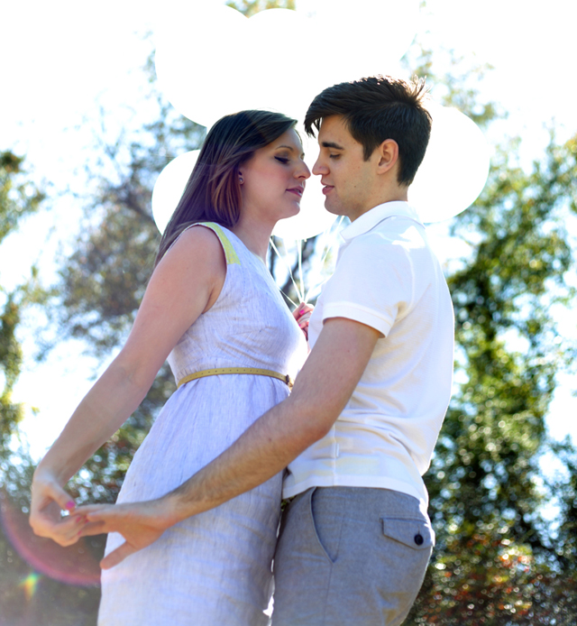
Above is my original photo, straight out of the camera. The photo is probably fine as-is, but I wanted to play up the hazy light, as well as warm up the color balance. On close examination, you can see that there is a lens flare right on their faces (and especially on the woman’s hair), so I wanted to blend the lens flare in that area.
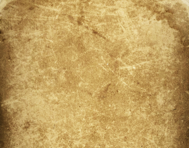
The first texture that I am using is going to warm up the background, as well as add a slight vignette. Use your Move tool to drag and drop the texture onto your original image. You will have your Background (original image) and Layer 1 (your first texture). On your Layers palette, set the Blending Mode to Overlay, and the Opacity to 50%. The percentage of your Opacity will vary from photo to photo, but 50% is a good starting point to see how the texture affects your photo.
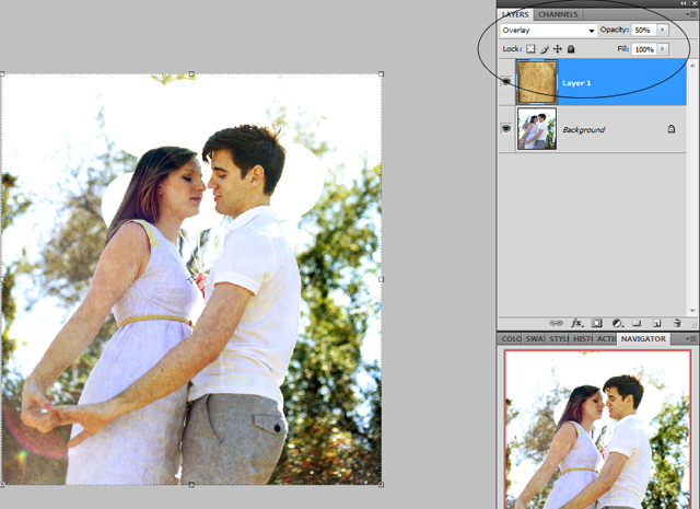
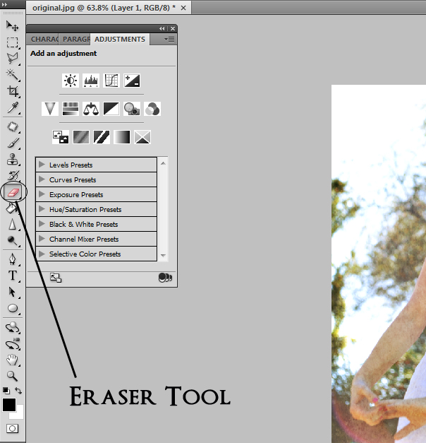 In the left-hand toolbar, select the Eraser tool
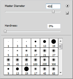
Right click once on your photo to bring up your brush menu. Select a brush with a soft edge, such as 200 in this case. Leave the Hardness at 0, but increase the Master Diameter to be large enough to erase certain parts of your photo in one click. Here, I set mine at 450.
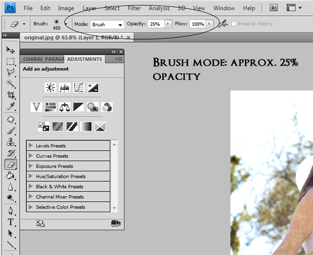
We want to erase some of the texture on the subjects, but only a very small amount, so set your Brush Mode to a small opacity, somewhere in the neighborhood of 25%.
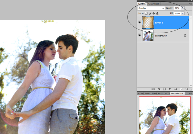
In this case, I went over both subjects once with my eraser at 25%. I didn’t worry about getting every last bit of the texture – I moved my eraser from their heads to the bottom of the frame in one motion. As you can see, the texture added some warmth to the trees behind them.
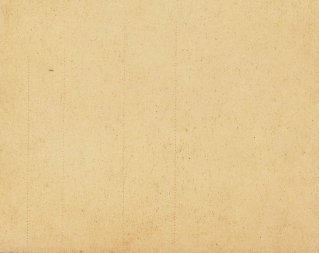
Now, I wanted to enhance the hazy backlighting, so I selected a really simple texture without a lot of color variation: just a nice, warm texture.
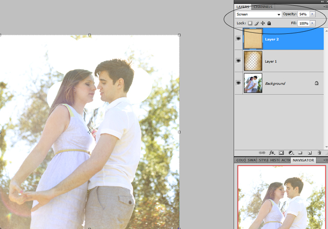
Drag and drop your next texture onto your previous texture, creating Layer 2. This time, set your Blending Mode to Screen, around 50% Opacity for starters. I felt like 50% wasn’t quite enough for this particular photo, so I increased it to 54%. A small percentage increase can go a long way with textures.
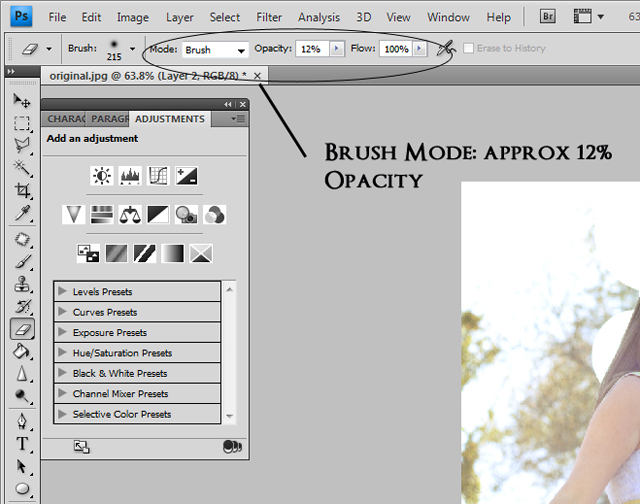
Select your Eraser again, but this time, set the Opacity even lower, in this case, 12%. I wanted to remove as little of the texture as possible, only from their faces, in order to preserve the detail in their hair and facial expressions.
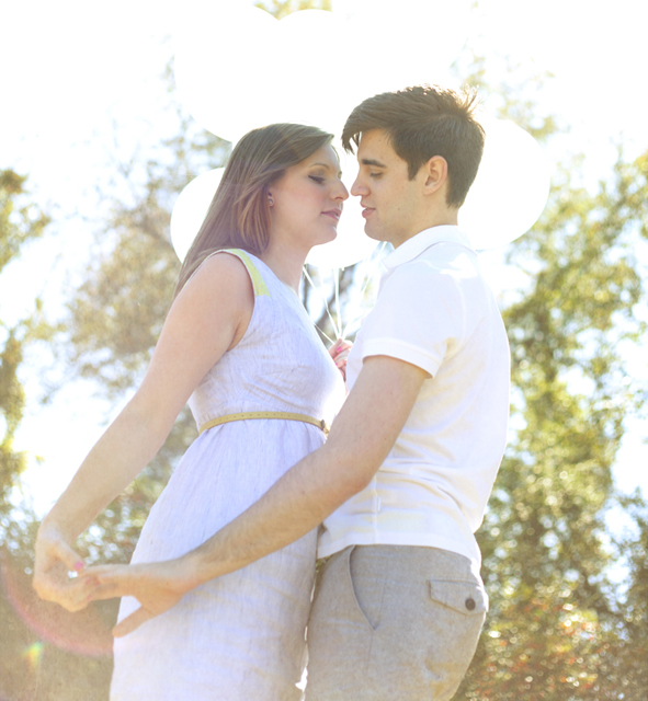
As I mentioned before, the Opacity for your Blending Modes, as well as the Opacity of your Eraser, will vary from photo to photo. Be sure to play around with different opacities, and keep in mind that less is usually more when it comes to erasing, because the idea is often to have the layers blend together seamlessly.
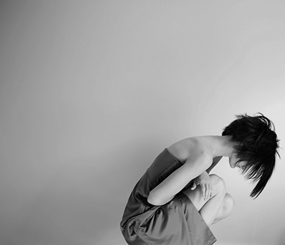
For this photo, we are going to look at how a texture can add interest to negative space, using the same drag-and-drop then erase method as above.
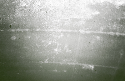
I chose this texture because it had a bright center, but also sort of a grunge vibe to it with all of the different marks.
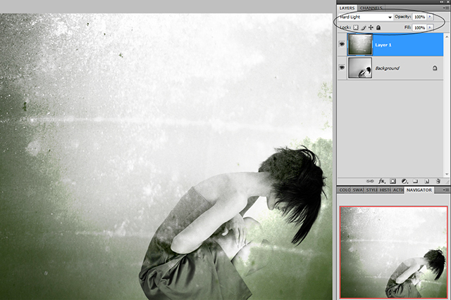
The Blending Mode is set to Soft Light in this case, which is similar to a mixture between Overlay and Screen, like we used above. I really liked the intensity of the texture on the original photo, so I left the blending mode all the way at 100%.
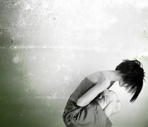
I felt like the texture on the subject was a bit much, so I selected my Eraser tool at 15% Opacity, and erased part of the texture on the subject, as well as the lower-right corner of the frame.
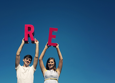
You can also use textures to add a whimsical element to your photos. Some people add bokeh textures, while others add clouds (I am a fan of both, personally)! For this shot, I thought it would be fun to add one of my film textures, to give the photo a retro, slide-film vibe.
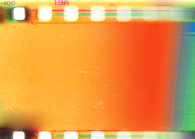
This is a scan of a 35mm negative of mine that didn’t turn out, but I loved the colors. Sometimes you find textures in the most unassuming places, so always been on the lookout for textures to add to your library, because you never know when they’ll come in handy.
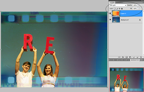
Drag and drop the texture onto the photo. Sometimes, when you are working with a film negative texture, you will need to use your Eraser to blend portions of the negative that obstruct your subject, but in this case, I felt as though the negative wasn’t too overpowering, so I left the Blending Mode at Soft Light, 100%, and did not erase.
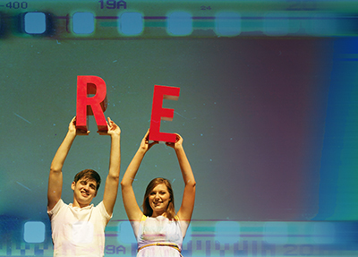
As you can see, the negative not only changed the look of the photo, but it also added warmth to their skintones
These are just a few examples of ways you can use textures, but we’ve really only skimmed the surface. If you are just beginning to experiment with textures, then collect as many of them as you possibly can until you find what works for your photos. Textures can be purchased or downloaded for free online by the thousands, but as I said before, you can also create your own. My texture library is a mixture of my own, as well as ones I have purchased from others, and I use all of them on a regular basis.
![]()
 About the Author: Anna Gay is a portrait photographer based in Athens, GA and the author of the dPS ebook The Art of Self-Portraiture. She also designs actions and textures for Photoshop. When she is not shooting or writing, she enjoys spending time with her husband, and their two cats, Elphie and Fat Cat.


Loving the film strip texture! I am heavily using clouds at the moment, but I might have to switch things up to try something like this 🙂 Great tutorial!
Great tutorial, thanks for sharing and reminding me to have a play with textures and particularly tweaking them with blending modes.
Thanks
this is very helpful, thank you for sharing!
I suggest instead of “erasing,” learn to utilize the “masking” features.
I have really gotten into textures recently and went to a gem and mineral show last week-end just to take close-ups of the different patterns and colors to use as textures. I haven’t had a chance to try them yet (they don’t fit with the wedding I am editing) but can’t wait.
I also agree with Laura – the masking feature is more helpful!
What a fun way to experiment with the look of your photos! Thanks for sharing!