by Guest Contributor Kim Drury of Madilu Designs
Maybe you’re just starting out. Maybe you’ve been in business for a long time. Whatever the case, you’ve made a decision to put your business in the public eye. How you choose to present yourself to the public is very important.
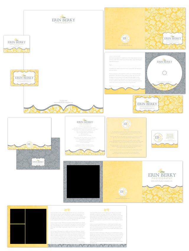
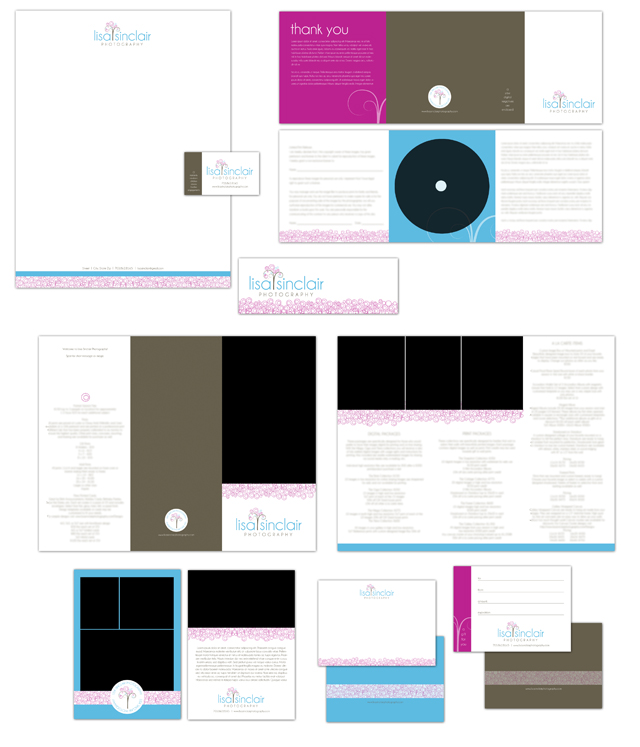
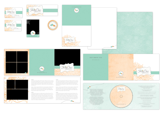
Obviously you want to come across as professional. Consistency is just one part of the overall presentation. You know those logos that immediately come to mind? Think Nike, the American Red Cross, FedEx and more. Those are just a few, but chances are you know what they look like. One reason for this is because they are consistent. The logo has the same appearance, whether it’s print, web or promotional items. You see it over and over … and you remember.
How do you achieve the same success for your business? If you haven’t started developing your logo, it’s best to stick with something really simple until you’ve established a direction. Even just a line of text for your business name is sufficient. If you go too fancy, you run the risk of people starting to remember that as your logo. Think simple typefaces like Times, Century Gothic, Goudy, Garamond, Perpetua … these are a great start.
If you have a logo, it’s important to use it in the same manner each and every time. Don’t switch colors unless it’s part of your overall brand. If you have a pink and green logo, keep it pink and green. Don’t decide to switch it to blue and yellow one day and then purple and gold the next. It starts to confuse your clients.
It’s definitely OK to update and refresh your look. People do it all the time. The most important thing is not to do it too often. If you find you’re switching your identity every other month, you run the risk of clients not remembering who you are and having to start over.
Some businesses are so tied to their brand that their clients actually refer to them as such. “There’s the purple photographer” is commonly used among clients and industry peers for someone who has consistently used purple in her business. She even gives her clients a little purple promo item at the end of a meeting, making a lasting impression.
Other things to keep in mind are scaling and appropriate usage of the elements in your logo. Don’t distort to fill space. It changes the appearance.
If you have a logo with multiple elements, have guidelines for proper usage. Maybe you only use the name when space is too small to allow for your entire logo. It’s possible you’ll only be able to use a limited number of colors in a publication. Have something in place so it’s always the same. Reference Pantone colors or color values. Those are things to discuss with your designer and make sure everyone who has access to your logo, especially employees and vendors, know the correct manner in which your logo is to be used.
While it seems like it’s a lot of little details to remember, it pays off in the long run when people recognize you as a professional in your industry.
About the Author: Kim of MadiLu Designs specializes in custom marketing materials for photographers. She has 15 years experience in the design and printing industry, and has been self employed for the past five years. Kim is a mom two boys and two girls. A few of her favorite things… sunshine, hot chocolate, running and helping others.
Visit her website at Madilu Designs.


Great information! Thank you for sharing with us.
Great info!
beautiful work, Kim!
great post! over the past two months i’ve found this to be a part of my business i have enjoyed fine-tuning.
I have liked rock the shot of fb!!
Great post with some really useful insight! Thanks!